Revamps that Resonate: Successful Brand Reimaginations that Made Their Mark
What makes a good rebrand using case studies of three successful global brand transformations.
Introduction
If you're a business that's been operating for some time, chances are that you've thought about giving your brand an overhaul. After all, it’s important to keep up with industry trends and the latest designs if you want to remain competitive.
READ MORE: The How, Why, and When of Rebranding: Lessons Learned Transitioning from Evocati LLC to Evocati PR
But how do you know when it's time for a rebrand? And what is the best way to go about conquering that beast?
Let's review some case studies we've gathered and what you can learn from them as you seek to rebrand your business.
Google Continues to Stay Ahead
(Source: Squarespace)
In 2015, Google reviewed its logo and said it was ready for something new. It was too loud and far too reminiscent of the 2000's. This is a tech company, and an outdated brand is a glaring red flag to investors and consumers. So, they took action. Gone was the clunky logo with serif font, shadow, and glare.
In was a sans-serif font, a clean and concise new logo that inspired a new wave of energy in the tech giant. Google enacted this change across all platforms and devices after it announced a major restructuring.
Consumers were confused at first, but as our understanding of "modern" changed over time, we observed that Google was ahead of the game. They were spearheading change not just through their globally adopted technology, but through their branding now too.
Key Lesson from Google
Let's face it, your company, like Evocati PR, can't pioneer change on a scale like Google. We are not built to "organize the world's information," but we can learn from them.
Rebrands like Google's can be seen across global corporations like Airbnb, Coca-Cola, Gatorade, and Doritos. All had design changes along these same lines, some even before Google. These are just pivots to showcase the modern focus of a brand's mission. If this is what your brand needs, look no further than Google.
This means your business should understand current design trends, review recent case studies, and update your brand to fit modern ascetics. Consider simplifying your logo and using a sans-serif font like Google when you rebrand.
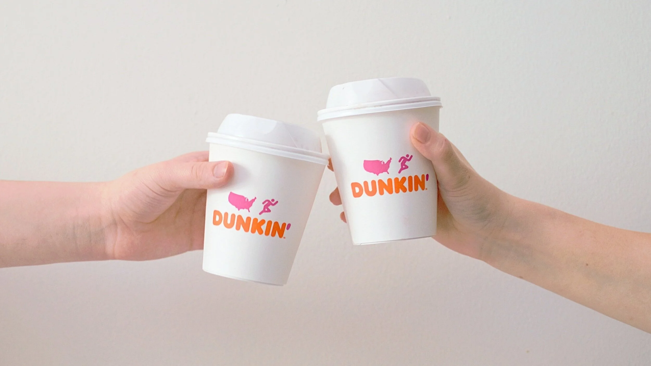
Or you can go even further, like Dunkin’ did.
Slam-Dunkin' Donuts Out of Here!
America Runs on Dunkin’ (Source: Squarespace)
In 2019 we officially said goodbye to Dunkin' Donuts, and hello to Dunkin'. The company's rebrand was a visual showcase of its new "beverage-led, on-the-go brand." Meaning, they were going to serve great coffee, quick. While they kept their color palette the same, and cut their name in half, the new branding was a big change for a company of its size.
Their visual cues became shorter, simpler, and more modern. They explicitly stated why they rebranded, and what they wanted. And it worked.
Dunkin' took the slow and steady approach, spending over a year testing logos, designs, and everything else before announcing the change. Their announcement superseded implementing the change by four months.
Key Lesson from Dunkin'
While very few companies have the luxury of patience from the top, a deliberate rebrand focused on research and testing is the best way to go.
Dunkin' opted for a facelift rather than a teardown and rebuild. This is not always the best route. For Evocati PR and for Dunkin' this was the best option. Sometimes a monumental shift in business focus needs to be reflected with a monumental shift in branding.
They understood the business change informed the branding change.
Dunkin' shifted its branding to match its strategic goal. It sought to focus on coffee-on-the-go, speed, and drinks as their specialty.
Which brings us to Meta.
Zuck and Facebook Go Meta
(Source: Squarespace)
Mark Zuckerberg is a tech genius who never shies away from risk or change. He launched the largest social media platform in human history from his Harvard dorm room and later dropped out to work on Facebook full-time. Fearless.
That is why when he announced the Meta rebrand, we all looked on in skepticism. Zuckerberg continued following his instincts.
He was not worried about the risk of entering such an underdeveloped industry, nor was he worried about the haters and trending hashtags. He was simply forging a new path as he had done for fifteen years.
The name was meant to demonstrate the new approach Zuckerberg and his team were taking—embracing the Metaverse. This came with a new logo, a new name, and a new industry vertical. The Meta rebrand reflected his vision for the future.
And it stuck.
Key Lesson from Meta
The Meta rebrand is viewed by many as a failure. I hold a different perspective: Meta's rebrand fits perfect.
The new brand encapsulated their business change, it fit the company's history and leadership ethos, and showcased even bigger "big tech" opportunities in the Metaverse and AI.
Facebook and Meta have not been without controversy in the past. A rebrand like this doesn't absolve a company from addressing cultural challenges or its obligations to shareholders. It was however forward-looking.
When rebranding, look ahead at what's next in your industry and determine if those trends can inform where you go.
It worked for Zuck. It can work for you.
When we think of augmented reality, AI, and more, consumers and business publications are immediately drawn to what Meta is doing. All in part to their rebrand.
You Got This
Effective rebrands mostly go unappreciated by consumers except for PR nerds like us, but beware—a bad rebrand could become an albatross around your neck.
READ MORE: Navigating the Perils of Rebranding: A Deep Dive into Brands that Stumbled
An effective rebrand requires strategic thinking and a focus on the future. Consider modern design elements, ensure any rebrand reflects your change in business services, and keep an eye on future trends and opportunities.
We’re here to help you navigate the rebranding process. Be sure to contact us today for support!


